Apricus Hill
PREMIUM WINE BRANDING.
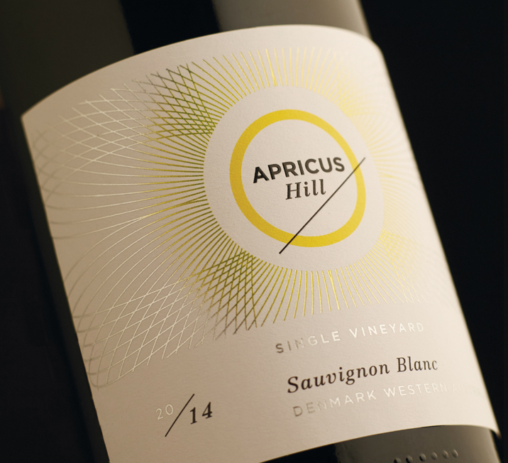
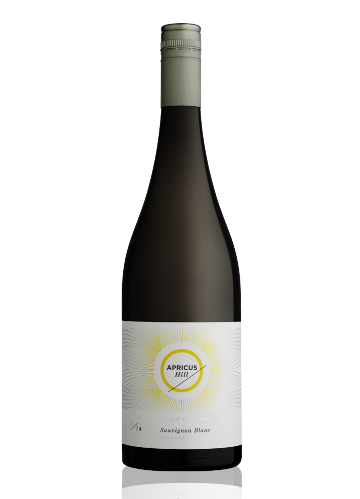
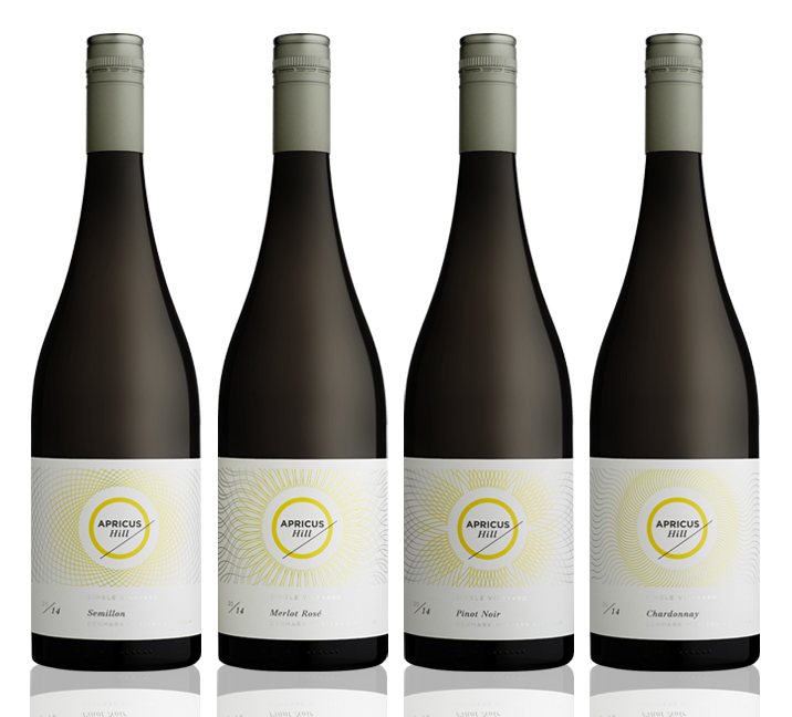
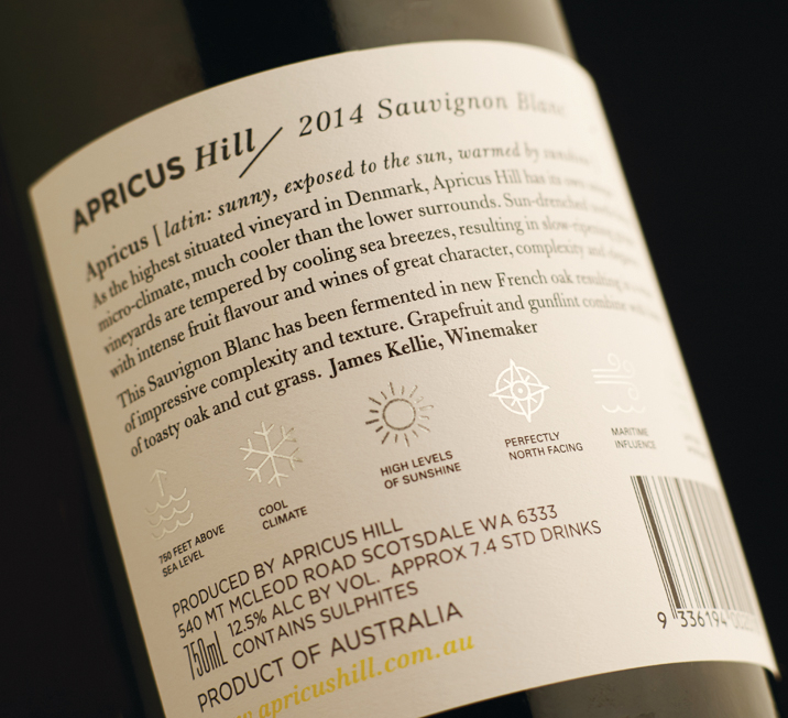
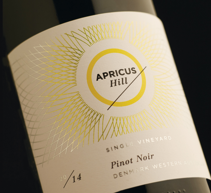
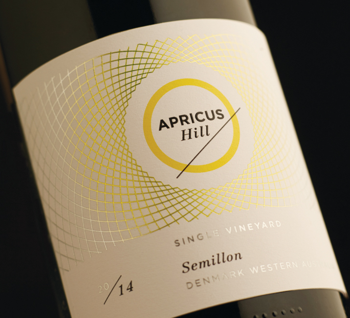
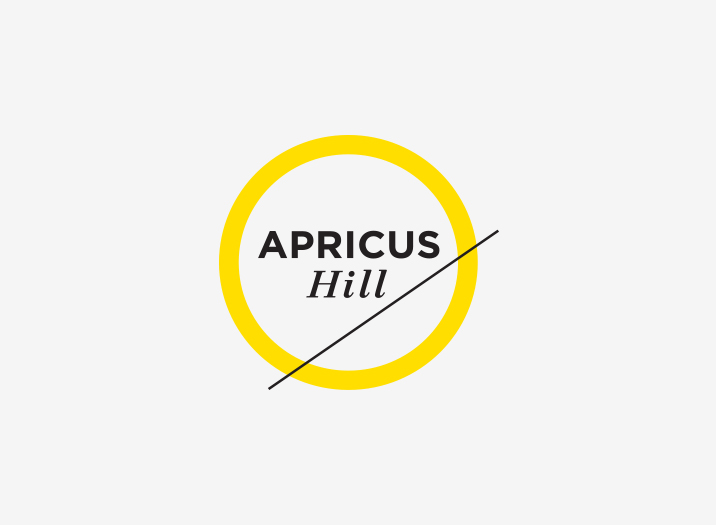
In latin, Apricus means 'sunny, exposed to the sun, warmed by sunshine'. Apricus Hill is a sun-drenched winery situated on the highest vineyard in Denmark, Western Australia. The logo developed for Apricus Hill is quite simply, a graphic representation of the words 'sun' and 'hill'. Each label has its own differentiating intricate pattern radiating out from the logo like rays of sunshine. The pattern is silver foiled to create a stunning label that is richly embellished, clean and modern. The back label features six icons which represent attributes of the winery which greatly influences the wine and highlights the points of difference from other wineries.
Brand Identity
Brand Positioning
Brand Story
Wine Shipper
Wine Branding
Illustration
Copy Writing
Art Direction
Print Management